Rebrand of Sublime Media
Summary
In 2023, I lead the design effort to rebrand the company I work for, Sublime Media. The company was founded in 2000 and its logo hadn't been given more than a light refresh in 20+ years, and the company had never really had a systematic brand identity. The company did have a strong company culture, and still does. The core challenge of this endeavor was to create a brand identity that connected to the company's history while representing its culture better than ever before.
Logo design
The first thing we tackled in our rebrand was the logo. From the beginning our strategy was to make the logo the cornerstone of the brand. All other design elements would branch out from that core design. Given its importance we spend a lot of time iterating in a wide variety of styles. Our goal was to land on a design that was inviting, creative, and professional. Something that spoke to the fact that we're a small company of creatives but we work with some of the world's biggest brands.
The final design embodies those qualities well. It's polished but friendly. The rounded corners and curves of the typography are inviting to the viewer. The touch of ultramarine in the tittle in Sublime adds visual interest and became a shape element used elsewhere in the brand, expanding the logo's presence in our visual media, without overusing the logo.
Brand mark
Derived from the tittle of the I in Sublime, and affectionately called “The Pick,” after its guitar pick like shape, Sublime’s brand mark is best used when space is limited and brevity is key.

Color
The keystone of Sublime’s color palette is Sublime blue, a shade of ultramarine. Sublime blue is only used in the logo and brand mark.
Blues analagous to ultramarine are the dominant brand colors. Neutrals are the primary palette of our typography and add depth to our whitespace.The warm colors include reds and yellows that are meant primarily for use in graphics and illustrations and system feedback.

Illustration
You can see the use of the tittle shape in the backgrounds of some illustration, as well as the cool color palette centered on the ultramarine in the logo. While we allow for a variety of styles and subjects when it comes to people natural depictions that showcase diversity are preferred.

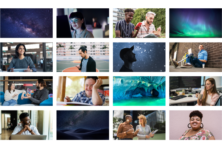
Photography
Photography gives us the opportunity to show the wonder and diversity of the world. When we select photography we choose photos that feel authentic, use naturalistic lighting, and have no obvious filters applied, including color overlays. Photos are in full color. When photography includes people we pay special attention to diversity and are inclusive as possible.
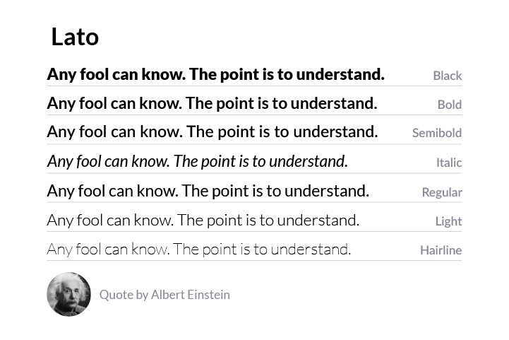
Typography
We selected Lato as our brand typeface for its versatility, readability, and inviting look.
To see more of Sublime's new brand in action, visit sublimemedia.com
Back to portfolio